Friday, November 20, 2015

Activity 5

Blog Post


Create a landscape utilizing foreground subject matter to create a sense of depth. Discuss how the resulting image is likely to be read by the viewer.


I think this resulting image is likely to be read as plain and normal. Just like regular open space and a pathway to something else, possibly other things. Many people can see many other things and get many ideas from a simple picture like this. The pathway can be to something else, and people like the look of the pathway and the old trucks, and rusty, antique look on the side. Showing that there could be much more out there with the pathway, and that new things could be beyond the pathway and they are moving on from old things. Things like this could be seen by the viewer.


Thursday, November 19, 2015

Activity 4

Blog Post


Create two photographs in a location with tall buildings or trees using both formats. Create a closed and open landscape at one location. Discuss the different ways we read the resulting images.


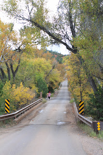
 This picture is a closed Landscape Picture. It's closed in because of the trees and plants that are taking over the side leaving only a small amount of space open. I think we would read this as being closed in, and having some type of closure. There isn't much to take from this picture. I think when you have a closed landscape you can't do much with it, you just have to stick with what is already there for you. It can also help when you don't have a lot of ideas for what you want to take pictures, so you can do closed landscapes because everything is kind of already there for you. I think when people used close landscapes, they like that everything is just there for them and its a passing use for a somewhat good picture, they having it all there and that they don't have to alter much.
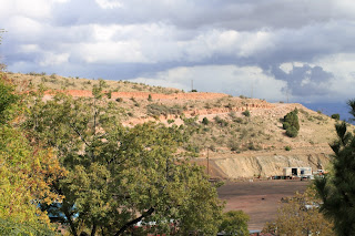
This picture is an open Landscape Picture. You can see the open space over the tiny hill that the picture was taken. I think we would read this as freedom, and being open. We can do a lot with an open space, and we can take different ideas from it. We can make our own thing out of it or we can use what it gives us. I think we have a lot more options with an open landscape than a closed one. I think when people take pictures of mostly open landscape it says a lot about them, they like the freedom, they like the openness, and they like having an open mind with the option that they can do anything with the landscape they are using for the type of picture they want or that they could just leave it alone and still have a great picture there for them.



Friday, November 13, 2015

Activity 3

Blog Post


Compare and Contrast a landscape photograph with a landscape painting. Discuss the expressive possibilities of each medium using your examples to illustrate your argument. Choose your examples carefully as representative of the medium.


Ed Mell Panting
David Edwards Photography 
These two images are very similar. One obvious reason is the landscape setting they were both chosen to be put in. They both have the red rock and the clouds clustered together, along with the darker rain clouds coming with them. The set of the rocks and how they are put together is very different and also the way the clouds are set up in the painting and picture. There is a tiny creek going through the mountains from the picture, and there is no water in the painting. 

The painter could have made his painting SO different from the photographers, even though they are in the same landscape. He could of added as much as he wanted where he wanted, he could have made the lighting anywhere or chose to have none. It's all up to the painter, but with photography you kind of have to work with what you already have. You can use certain tools to get the look you want and you can sometimes get rid of or add things into the picture to make it the way you want. Then again you do not have as much freedom as the painter when you are taking photos. 

Friday, November 6, 2015

Activity 2

Blog Post


Find two landscape photographs that question social values or act as a metaphor for personal issues that the photographer is trying to express. Discuss whether the communication is clear or ambiguous and how this communication is conveyed.


I think what this photographer was trying to say is that they want freedom. They want to be on an open road and go about and travel, they want to just enjoy the surroundings and see what else they can find. Communication seems pretty clear in this photo. When you drive and travel you can see many different and new things and maybe thats what they want. They can have the ability to experience and watch new things and they are very open to take that opportunity! 


This photographer likes to see the beauty in things, they like color, vibrance, and life. No matter how bad or crazy something is they can see the good in it and the good that is to come. They like natural beauty and can find it in anything. They like nature and natural things, they want things to just be themselves and just go with the flow. 

Activity 1

Blog Post


View the image by Walker Evans on this page and describe what you can actually see (objective analysis) and what you think the image is about (subjective analysis).

Discuss how effective Walker Evans has been in using a landscape image to communicate a point of view. Can this photograph be considered as art? Give two reasons to support your answer.

Make sure you include the image in your blog post with credit in the citation. When you analyze the photo, look for deeper meaning beyond the literal description of the photo.


Bethlehem, Graveyard and Steel Mill - Walker Evans 1935

I think the point of view is sad, especially because the picture is in black and white. When you look out all you can see is the graveyard, all the telephone poles, and just buildings. The view is kind of boring and with how boring it is it can make you sad. I think this could be considered an art because of the emotion this pictures give you. Landscape can give someone a lot of emotions, it can make someone happy, sad, annoyed, bored, or tired. Art is supposed to give you an emotion and this is a good example.


Thursday, October 8, 2015

Activity 4

Blog Post


Find two examples of photographs, which make use of maximum depth of field, and two examples, which have very shallow depth of field. Describe how the photographer's selective use of aperture affects the subject in each of the photographs you have chosen.


 These two photos right here have shallow depth of field. Shallow depth of field is when you make your subject your main focus and just that, nothing else. The subject is such clear quality and focus and everything else in the background or around is unfocused. The point is to get a feel for the subject itself and get good clarity on it. The photographer took shallow depth of field with nature. So you can see all the details in the leaf, and the rose. You can see the glowing red on the flower and how old and dry the leaf
looks. Shallow depth of field is always just focus and clarity on the subject, never anything else! These two pictures are good examples of shallow depth of field.


 These two photos are examples of maximum depth of field. This is when everything in the picture is in focus! You can tell what the subject or subjects are but everything along with that is in focus and its not just clarified or focused onto one thing. You can see the clear brown and tannish color of the string rays and you can see the clear color of the white sand/dirt at the bottom of the ocean. Along with that you can see how crystal blue the ocean water is as the string rays swim. Moving on to the desert photo, you can see the
mountain and the dirt, you can see the rest of it in the background as well. Everything in each picture is clear and has good quality and shows a perfect example of maximum depth of field.

Activity 3

Blog Post


Find two images that have been shot into the light or included the light source. Explain how the photographer may have gone about taking a light meter reading for these photographs.


 These two images have obviously been shot into the light with the light meter. You can tell that the subject got shot into different types of brightness with the light. One with the subject bright and the background dimmed to bring the focus to the subject more, and then the one with the subject with a brighter light and the background lighter as well. It seems as if the photographer is testing the light meter to see the different types of results they can get with mixing lighter and dimmer pictures and then light on top of light pictures. I think the subject being bright and the background dim is better because having both things being bright throws the picture off, and can get distracting. You can tell they were testing the reflection from the face as well to see how bright
they could get it. 


Activity 2

Blog Post


Find an example of a photograph where the subject has been lit by a single light source and an example where more than one light has been used. Describe in each the quality and position of the brightest or main light and the effect this has on the subject. In the second example describe the quality and effect the additional light has.


J. Castro Photography
This photographer used one main light for this photo. They used the one main spot light they had to catch their subject, and instead of using it from the front to see the faces and expressions of the subject clearly they did it behind the subject. They used it right in the middle so you can see the shadows of the subject. I think they used the light this way because they didn't want the light having the main focus on JUST the subject they wanted the light to pick up the background and the mood all as one combined with the subject.


Joe McNally Photography
As you can see multiple lighting was used here. The photographer used natural light with a mix of their own the capture their subject and it's background. Both types of lights give good quality to this picture but kind of a weird effect. There's a lot going on from the shadow of the subject, seeing the difference from actual light and natural makes the picture kind of awkward and gives it an awkward mood.


Activity 1

Blog Entry


Look through assorted photographic websites and find some examples of subjects lit by hard life and examples of subjects lit by soft light. Describe the effect the light has on the subject texture, form and detail, and the overall mood of the picture.


Oleg Ti Photography
This is an example of hard light. Most photographers use it usually when they want a good look on focus of the subject, and most of the time thats on portraits. It's a good way of showing detail of the subject. For example you can see her facial features clearly and they bring out the sharpness of her jawline, her cheekbones, her shoulders and her nose. The hard light gives a good focus to her or whatever subject you use for the picture. This lighting and the way she is posed gives this picture a very serious mood.


Marc Edward Photography
This is an example of soft light. It is more natural and the photographer usually goes by whatever the natural light does, they can move around to give the subject a better look but usually go by how the light is already there. You can still see many features clear but many things are also in focus, but the subject is obvious. The mood of this picture is just very simple and relaxed.

Saturday, August 15, 2015

Activity 4

Blog Entry


Collect one image where the photographer has placed the main subject off center and retained a sense of balance and one image where the photographer has placed the main subject off center and created a sense of imbalance.
Discuss the possible intentions of the photographer in creating each image.
Create four images, placing the focal point and/or visual weight in different areas of the frame. Discuss whether each image is balanced.


This photographer has placed the main subject off center and the photo has balance. It has balance because it has other things to look at instead of just focusing on one main thing, and they all balance along with the subject. I think this was the photographers intentions, they have other things to look at but the whole picture combines together very well.


This photographer has also placed the main subject off center but the photo has imbalance. It has many different types of photography going on, like still life and nature. There are many things to look at though so that the picture does not get boring. I think the photographers intention was just still life, but they have many different things going on.


Balance
Balance


Imbalance

Imbalance


\


Activity 3

Rule of Thirds

These two photo's follow the rule of thirds because the subjects are in some type of corner. Also, if you added the grid it would be easy to take the picture apart and understand it better, there aren't many distraction throwing you all over the place. The pictures are very simple.


Not Rule of Thirds

These two photo's do not follow the rule of thirds because the subjects are in the center of the photo, and there are many distractions. If you put the grid on the photo they may be easy to look at but there are many things going on on the side. 


Friday, August 14, 2015

Activity 2

Blog Entry


‘To quote out of context is the essence of the photographer’s craft. His central problem is a simple one: what shall he include, what shall he reject? The line of decision between in and out is the picture’s edge. While the draughtsman starts with the middle of the sheet, the photographer starts with the frame. The photograph’s edge defines content. It isolates unexpected juxtapositions. By surrounding two facts, it creates a relationship. The edge of the photograph dissects familiar forms, and shows their unfamiliar fragment. It creates the shapes that surround objects. The photographer edits the meanings and the patterns of the world through an imaginary frame. This frame is the beginning of his picture’s geometry. It is to the photograph as the cushion is to the billiard table.’


Q. What does John Szarkowski mean when he says that photographers are quoting ‘out of context’ when they make photographic pictures?
A. I think he means that photographers like to think out of the box with their photos. They want to be very different and unique, and want a lot of creativity. Some like the idea of crazy and all over the place, or calm and plain. All are different.


Q. The frame often ‘dissects familiar forms’. At the end of the last century photography was having a major impact on Art. Impressionist artists such as Degas were influenced by what they saw. Look at these examples of Degas work, which clearly shows the influence of Photography, and explain why the public might have been shocked to see such paintings.
A. It is very detailed. There's a lot of things going on and different emotions with the painting.

Many people probably were probably shocked from the detail and emotion and creativity.


Another Example of a painting influenced by photography:
The amount of detail is the exact same. The painting is very simple though, there isn't much emotion. But the creativity is still there.

Thursday, August 13, 2015

Activity 1

Blog Post
Look through assorted photographic websites and observe how many photographers have moved in very close to their subjects. By employing this technique the photographer is said to ‘fill the frame’ and make their photographs more dramatic. Find two examples of how photographers seek simple backgrounds to remove unwanted detail and to help keep the emphasis or ‘focal point’ on the subject. Attach two images you find to your reply to this discussion.

                                              Pati P's photography
This photo is really focused on the girls face. This is more of a portrait photo but she fills the frame with the subject which is the girl. She blurs out the backgrounds so there are no distractions and the focus is the girl.


                                                      Tessa Barton's photography
Tessa is filling the frame with the bouquet of flowers, she focuses on the flowers and the bride holding them and blurs out the background for less distraction. The subject is the bouquet and she does a good job of filing the frame with it.